
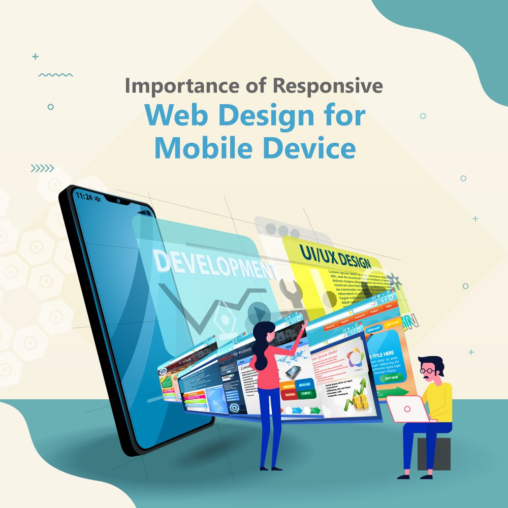
Importance of Responsive Web Design for Mobile Devices.
In the rapidly evolving landscape of digital business, providing the best possible user experience has become critical. With mobile devices’ indisputable dominance, a good online presence demands more than simply a visually pleasing website. Enter responsive web design, the crux of current digital strategies that has the power to make or break your user engagement metrics.
Understanding Responsive Web Design
Responsive web design is more than just a term; it’s a deliberate strategy that adapts the layout and content of your website to different screen sizes and orientations, ensuring an ideal viewing experience across all platforms – from smartphones and tablets to desktop displays. This adaptability is done through the use of fluid grids, flexible graphics, and media queries, which results in a smooth transition between devices.
The Mobile-First Imperative
Designing with a mobile-first attitude is not simply advised in a world where mobile users have firmly taken the lead, it’s required. Imagine a potential customer trying to browse your website on a smartphone and running across distorted pictures, broken buttons, and a confusing user experience. The effects on your brand’s reputation and customer retention are extensive.
By ensuring that your website not only fits the screen but also runs well, responsive design addresses these issues. No matter the device, the content becomes readable, the visuals scale correctly, and the navigation is simple. This platform-to-platform uniformity conveys a strong message about your dedication to user experience and accessibility.
Improved user experience leads to higher conversion rates
In today’s business ecosystem, user experience (UX) is a non-negotiable component. By removing the need for users to constantly pinch, zoom, or scroll, responsive web design directly improves UX. An easy-to-use browsing environment encourages interaction, lowers bounce rates, and ultimately boosts conversion potential.
Imagine a potential investor using their tablet to view your website while they are at a meeting. They can easily navigate through your services, case studies, and contact information thanks to responsive design. Without it, people can find it difficult to understand your value proposition and opt to look into other user-friendly options.
The Future of SEO
Websites that put the user experience first are rewarded by search engines, lead by Google. Your search engine results will improve if your website is responsive and meets Google’s mobile-friendliness requirements. With a responsive website, there is no longer a need for distinct mobile and desktop versions, which avoids duplicate content problems and guarantees a consistent presence in search results.
Additionally, responsive design makes it simpler for consumers to share and connect to your content because they may interact with it easily on any device. This natural promotion can have a big impact on your online authority and visibility.
Final Thoughts
Responsive web design is more than just a design decision; it’s a calculated investment in the online success of your brand. In a time when attention spans are shortening and consumer demands are rising, it is now essential for company success to support a variety of devices. You’re not simply adjusting to the present by using a responsive design strategy; you’re also future-proofing your online presence and building stronger relationships with your audience.
Remember that responsive web design is about creating experiences that resonate and convert, regardless of the screen in use, as we navigate the dynamic digital landscape. Therefore, make intelligent investments, create with meaning, and watch your company thrive in the mobile-driven era.
Latest Posts
- The Importance of Responsive Design by a Web Design Company
- Why Mobile Marketing is the Future of Digital Marketing
- The Evolution of Influencer Marketing: From Popularity to Authenticity
- How Social Media Platforms and Websites are Evolving to Support Direct Purchases
- Discover the Rise of Voice Search and Optimizing Content for Smart Assistants
- AI-Powered Marketing: The Next Frontier of Personalized Customer Experiences
- How to Use Content Marketing to Boost Brand Awareness
- The Role of Email Marketing in 2024
- Is Social Media Marketing Better for B2C or B2B Businesses?
- How to Use Content Marketing to Boost Brand Awareness
- Local SEO vs. Global SEO: Which One Is Right for Your Business?
- Social Commerce: How to Sell Directly on Social Media Platforms
- The Impact of Short-Form Video Content on Social Media Marketing
- How AI is Transforming Digital Marketing: Key Strategies for 2024
- How to Create a High-Converting Digital Marketing Funnel in 2024
- The Power of Video Marketing: How to Create Videos That Drive Results
- SEO vs. SEM: Which Strategy is Right for Your Business?
- Top Digital Marketing Trends to Watch in 2024
- White Hat vs. Black Hat SEO: The Ethics of Backlink Building
- The Impact of Social Media on Backlink Building
- 6 Benefits of Knowing Digital Marketing Effectively
- How to Build an Effective Social Media Marketing Plan from Scratch
- 6 Ways to Get Noticed on Instagram
- The Rise of Micro-Influencers in Digital Marketing
- Transforming Social Media Platforms into Sales Channels: A Digital Marketer’s Guide
- Tips and tricks to know how digital marketers optimize ads
- How Coimbatore Companies Can Perform Technical SEO Audits of Websites
- SEO Secrets for Driving Coimbatore Brands to the Top of Search Results
- The Role of Color Psychology in Website Branding
- Key Elements Every Brand Website Should Have
- Guide to Refresh Your Brand’s Online Presence Effectively
- Making Your Website Google-Friendly in 2024
- Choosing the Right Website Design Approach for Coimbatore Businesses
- Paid Marketing vs. Organic Digital Marketing
- Implementing Digital Marketing Tactics for MSME Growth
- How to Choose the Right Digital Marketing Agency in Coimbatore
- Insights into Effective E-commerce Design Principles
- Understand the psychology of design and how it influences consumer behavior online.
- Understanding the Power of Engagement Metrics in Google Ads
- A Comprehensive Guide to Google Ads for Small Businesses
- Meta Boosts vs. Meta Campaigns: What’s the difference?
- Tips to Converting Your Targeted Audience to Followers
- Tricks for Digital Marketing Success
- How to Develop a Digital Marketing Strategy
- Instagram Marketing Tips for Businesses
- Tips to Grow Your Website Traffic
- How to get your business the first page on google
- Why blog? The benefits of blogging in business and marketing.
- The Rise of Social Commerce and Its Influence on Branding Strategies in the Digital Age
- Tactics To Get Great Customer Reviews
- Scaling Your Startup: Digital Marketing Strategies for Growth
- The Power of Logo Redesign: How Brands are Boosting Their Future Prospects.
- Mastering SEO for Business: Essential Strategies to Drive Traffic
- Role of User Experience (UX) in Effective Web Design
- Role of Branding in Building Trust with Customers
- Future of Web Design: Innovative Technologies and Trends
- Importance of Website Speed in User Experience and SEO
- The Role of Typography in Effective Web
- How to Develop a Brand Voice and Tone as a Web Designer
- Brand Voice and Web Designer…
- Latest Web Design Trends to Follow in 2023
- How to Use Social Media to Build Your Brand
- Importance of Brand Storytelling in Building Emotional Connections with Customers
- Benefits of Consistency in Branding Across All Marketing Channels
- Do logos, logotypes, and symbols that classifies a company?
- Future of Branding in a Digital World: Trends and Predictions
- Role of Branding in Attracting High-Value Clients
- Importance of Responsive Web Design for Mobile Devices.
- Building a Brand Strategy that Aligns with Your Business Goals
- Mental Illness Among Social Media Pros
- Incorporating Ethical Principles into Logo Design for Business
- Understanding the Importance of Content Marketing in the Digital Age